Mind Hacks is all about short experiments or hacks you can do to discover how your brain is really working. There are 100 hacks. For example, hack #59 discusses how we actually hear with our eyes (you can check out the McGurk Effect for yourself). Or try #65 which explains Why Can't You Tickle Yourself? And goes on to describe how to build a self-tickling machine.
But the hack that really got my attention (no pun intended) was hack #37 Grab Attention.
Sudden movement or light can grab your attention, thanks to a second region for visual processing.
It turns out that besides our normal visual processing region of the brain (you are using the occipital lobe right now while reading this blog) there is a second region that deals with attention capture.
We experience it everyday. While talking with a friend at a park someone throws a frisbee to another person in the background. Without trying you notice this change of motion even though you are not looking directly at it. You can thank the superior colliculus for this little attention interruption.
As the authors describe it this region of the brain is not very sophisticated. But it does a good job of telling you to pay attention because something may be coming at you. You aren't sure what it is but you had better pay attention to it.
One of the next set of patterns I am working on getting out the door at Yahoo! covers the idea of Transitions (also known as animated effects or cinematic effects.) The connection between hack #37 and its application to transitions was immediately obvious. This is one of the reasons that moving something on the screen or causing it to fade or rapidly show up can get the attention of the user so readily.
So this fed into my thinking, "how do I use transitions for good and not for evil?" How do I use transitions to communicate the correct intention to the superior colliculus? As Kathy Sierra likes to say, "Learn to speak to the BRAIN, not to the MIND."
So a few days passed after reading this. I was starting to write up the rationale for the parent Transition pattern using the research cited in the Mind Hacks book. While doing some more research I stumbled across an article on 24ways that discussed the transition effects in the Scriptaculous library. At the beginning of his article, Michael Heilemann writes:
...let me just take a moment to explain how I came to see smooth transitions as something more than smoke and mirror-like effects included for with little more motive than to dazzle and make parents go ‘uuh, snazzy’.Turns out that Matt Webb is one of the authors (along with Tom Stafford) of Mind Hacks (duh!) Well that made sense. I listened to his talk and got very excited. I had been writing and talking about how to use and not abuse these effects on the web. Matt's talk and his writing in the Hack book (and other articles online) finally gave me solid grounding for those propositions.
Earlier this year, I had the good fortune of meeting the kind, gentle and quite knowledgable Matt Webb at a conference here in Copenhagen where we were both speaking (though I will be the first to admit my little talk on Open Source Design was vastly inferior to Matt’s talk). Matt held a talk called Fixing Broken Windows (based on the Broken Windows theory), which really made an impression on me, and which I have since then referred back to several times.
You can listen to it yourself, as it’s available from Archive.org. Though since Matt’s session uses many visual examples, you’ll have to rely on your imagination for some of the examples he runs through during it. Also, I think it looses audio for a few seconds every once in a while.
Anyway, one of the things Matt talked a lot about, was how our eyes are wired to react to movement. The world doesn’t flickr. It doesn’t disappear or suddenly change and force us to look for the change. Things move smoothly in the real world. They do not pop up.
A couple of examples stand out from the Broken Windows talk.
Dodging the Apple Widgets
Matt pointed out the odd effect used to dismiss the Apple Mac OS X Widgets. Instead of going away from you when dismissed, instead they fly out at you and fade out. The effect is as if the widgets are coming straight at you (like a star field) and whiz right by your head. Matt's point is that the action is "put the widgets away" but the effect communicates "look out their are flying widgets that are about to hit me." The action is for them to diminish in importance. However the superior colliculus is screaming "incoming-incoming-look out!".
What Just Happened?
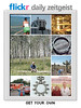
The second example is the Flickr Daily Zeitgeist a blog sidebar plugin (Matt discusses this in detail here). When new photos show up they fade slowly in place overlaying four photos within the tile of photos. Not bad. You may or may not notice the photo showing up but that's ok. Its very secondary. However when it goes away it rapidly scales down revealing the images underneath while replacing one of the four images. The sudden rapid movement once again gets the superior colliculus to say "What the..." You look and by the time you glance you are not really sure what happened.
How the Real World Works
Matt also makes the same observation that I have discussed before. That real world objects don't just pop in and pop out, appearing and disappearing suddenly. We usually see them go away or go somewhere in particular. By creating an online space that never behaves this way it makes for a more brain-intensive experience in trying to determine "what just happened."
A Few Transitions
Just so we are all on the same page, here are some of the transitions that are being reviewed for the Yahoo! Design Pattern Library:
- Brighten. Raise the luminosity or opacity of an object. Used to call attention to an area. The opposite of dim.
- Dim. Lower luminosity or opacity of an object.
- Expand. Animate an object growing.
- Collapse. Animate an object shrinking.
- Slide. Show an object move out from another object while being attached to that object.
- Self-Healing. Once an object is removed from an area a hole is left. Once the object is placed elsewhere the hole seals up, effectively healing itself.
- Animate. Simply animating position.
- Fade In. Cause an object to appear by fading in the object's opacity.
- Fade Out. Cause an object to disappear by fading out the object's opacity. Often the Self-Healing transition is used to close the hole left by the object.
- Spotlight. Usually used to momentarily highlight a region that has changed. The highlight is often combined with a Fade Out to create a One-Second Spotlight pattern.
To me the key thing that any interface must do is communicate clearly and effectively.
Transitional effects should communicate the state of the interface or the actions that have just taken place.
- If an object fades away we know it changed state from visible to invisible even if we are not staring directly at the object.
- If an object fades into view then we know the object has arrived. It was not there but now is here.
- If an object fades rapidly it is seen as more important. If it fades slowly its importance is lower.
- If an object is coming at us (getting larger and appearing to go past us) then we think of it as something that is important (and dangerous).
- If an object zooms down in size rapidly and disappears it will capture the user's attention immediately. However if the object was not in the user's immediate focus (user was not directly manipulating the object) they will glance to see the change but may not even be able to tell what object went away.
Purpose of Transitions
First, they are primarily for communication. Keep in mind that transitions reinforce communication. Having said that, it is important that the goal of communication be kept in mind regarding any transition effects.
Second they can be used for engagement.
Interacting with an area on the screen that responds by slightly growing or seeing an accordion pane "snap" into place creates a slightly richer and compelling experience. The interface seems more alive. Of course going slightly overboard can be the equivalent of blink for Web 2.0 (blink 2.0?)
One can imagine situations such as in games where engagement can take a more important role. However, in most web sites, communication is the most important purpose for transitions with engagement being second.
Guidelines for Transition Effects
From the discussion above we can extract some general principles for transitional effects.
1) The more rapid the change the more important the event.
2) Rapid movement is seen as more important than rapid color change.
3) Movement toward the user is seen as more important than movement away from the user.
4) Very slow change can be processed without disrupting the user's attention.
5) Movement can be used to communicate where an object's new home is. By seeing the object moving from one place to another we understand where it went and therefore will be able to locate the object in the future.
6) Transitions should normally be reflexive. If an object moved and collapsed to a new spot, you should be able to open it and see it open up with the reverse transition. If you delete an object and it fades, then if you create an object it should fade into place. This creates a concept of symmetry of action.
I would love to have feedback on what you think are the proper usages for these kinds of transitions.
Technorati Tags: ajax, design, patterns, design patterns, ria, user+experience, interaction design, scriptaculous, ypatterns, billscott
4 comments:
I have had the opportunity to sit in on a number of usability tests that involve a few transition effects.
I agree that transitions can be a powerful method of communicating interface change. But there is a fly in the ointment: advertising.
Ads on the web have taken advantage of how the human mind works and have exploited it feverishly. Nevermind blink 2.0, ads have been hammering transitions for a long time (punch the monkey!)
In many of the tests I have seen, users initially ignored transitions meant to communicate useful information. They did this because they perceived it as ad-like and they had learned to ignore ad-like things.
This doesn't mean transitions are bad, just that the water has been a little polluted and it may be a while before users recognize that transitions can also show something in which they would be interested.
Good points Jon. I agree.
Some lessons seem to emerge.
- The misuse of effects by ads should teach us to be cautious about overusing transitions.
- Try not to rely on transitions solely for communicating change in the interface.
- Keeping the transitions as near to where the user is looking (focus of attention) will make them discoverable and feel less like an ad
- We need to try to make sure our ad sponsored apps do a good job of keeping ads in there space.
- It should remind us that gimmicky effects will annoy and distract rather than communicate to the user.
It is interesting that in a content based applications that is driven by page views the annoying ad model really does work. People really do look. People really do click. But in an application on the web that is sponsored by ads users will find the ads more annoying since they will feel some "ownership" to the application (using it frequently, having their data in it, etc.). I think a more subtle ad model will be more successful. [however, that is not based on anything other than my wishful thinking-- people's behavior on the web always surprise me]
Bill: to tickle yourself, run a fingernail across the roof of your mouth. For best results, go from back to front with firm pressure.
Cool! Kent I knew you were the fount of DHTML wisdom, now my respect for your worldly wisdom has grown by leaps and bounds
:-)
Post a Comment